The story behind forward festival's graphic design
The story behind forward festival's graphic design
The story behind forward festival's graphic design
The story behind forward festival's graphic design
The Forward Festival has been around for half a decade now. This is a perfect moment to pause and look back on an eventful journey. At this point, we could speak of the hundreds of speakers or of the many great moments we experienced with you. Instead, however, here is the story of our festival design. Some write long press releases, others hold a press conference, we release the graphic design for the next Forward Festival. This is a very personal matter for us. The festival design is not only our face to the outside, but reflects our mindset.
The Forward Festival has been around for half a decade now. This is a perfect moment to pause and look back on an eventful journey. At this point, we could speak of the hundreds of speakers or of the many great moments we experienced with you. Instead, however, here is the story of our festival design. Some write long press releases, others hold a press conference, we release the graphic design for the next Forward Festival. This is a very personal matter for us. The festival design is not only our face to the outside, but reflects our mindset.
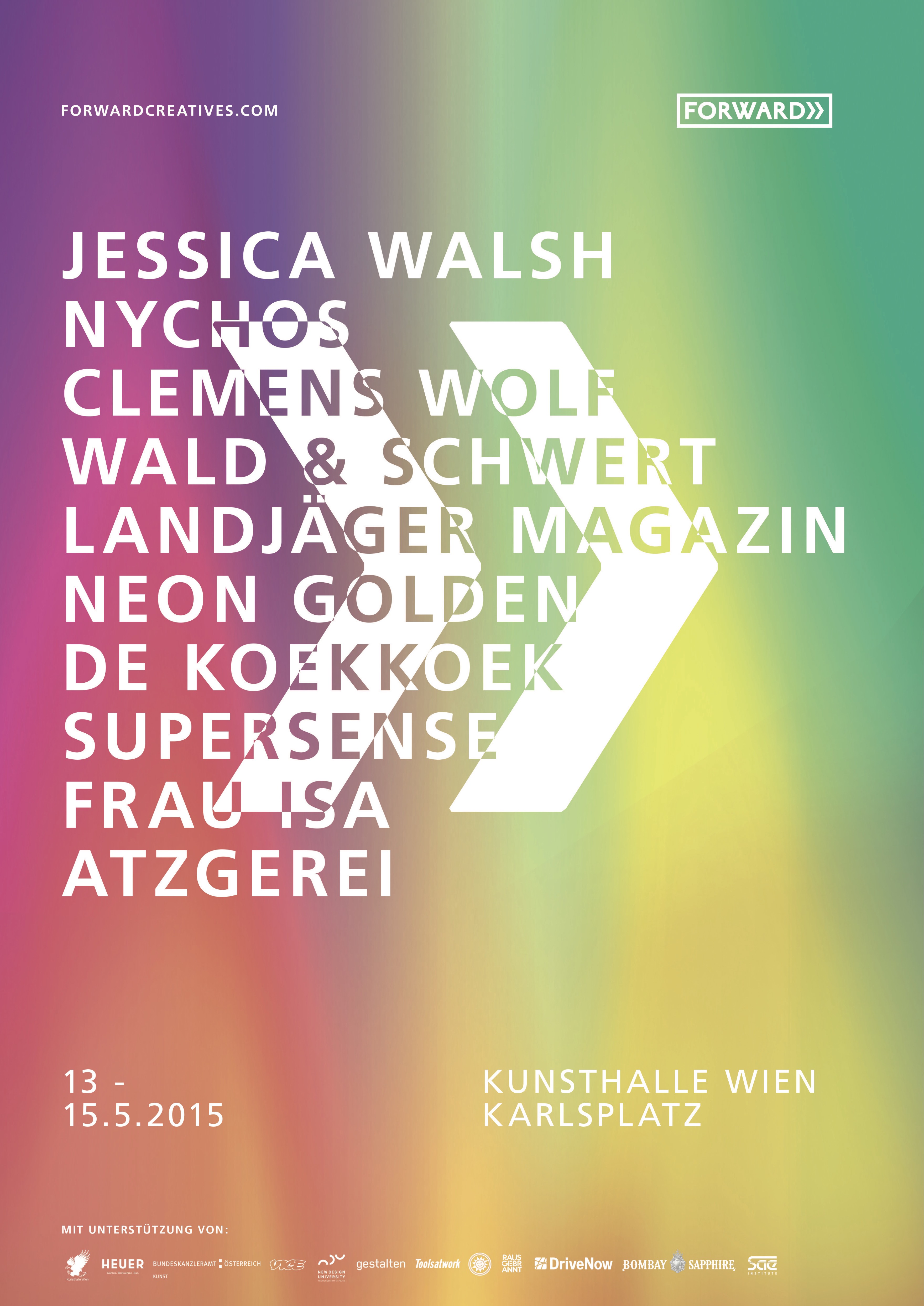
Everything started in 2015. In this year, the first festival design of the Forward Festival saw the light of day. It was a colorful light from the pen of Klaus Fleischhacker. The spectral colors immediately catch the eye and symbolize the essence of the Forward Festival. Since its inception, what makes the festival stand out is that it doesn’t have a common, but a spectral thread. This embodies Forward’s interdisciplinary approach. We don’t just focus on graphic design or architecture, but on providing a stage for the entire creative industry.
Everything started in 2015. In this year, the first festival design of the Forward Festival saw the light of day. It was a colorful light from the pen of Klaus Fleischhacker. The spectral colors immediately catch the eye and symbolize the essence of the Forward Festival. Since its inception, what makes the festival stand out is that it doesn’t have a common, but a spectral thread. This embodies Forward’s interdisciplinary approach. We don’t just focus on graphic design or architecture, but on providing a stage for the entire creative industry.
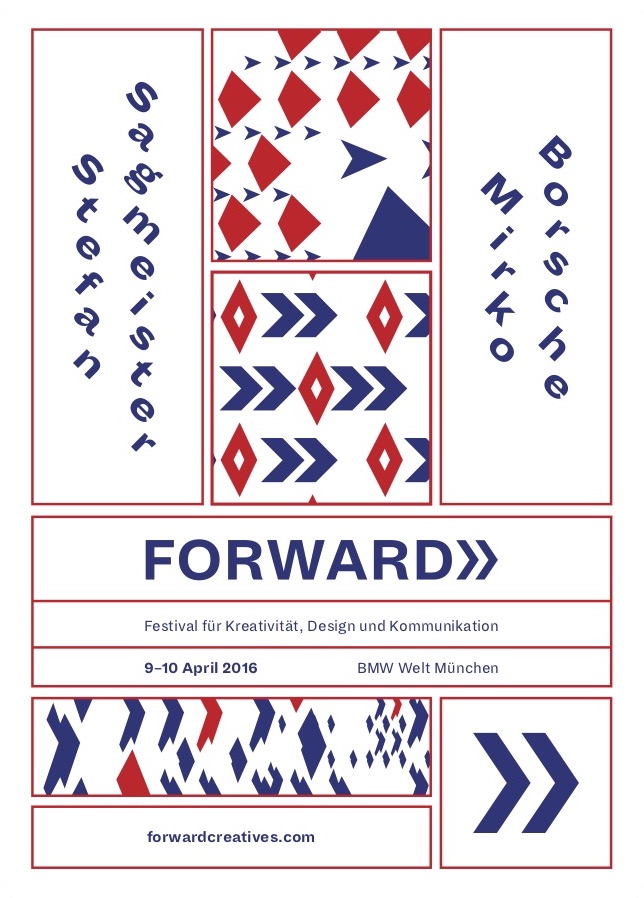
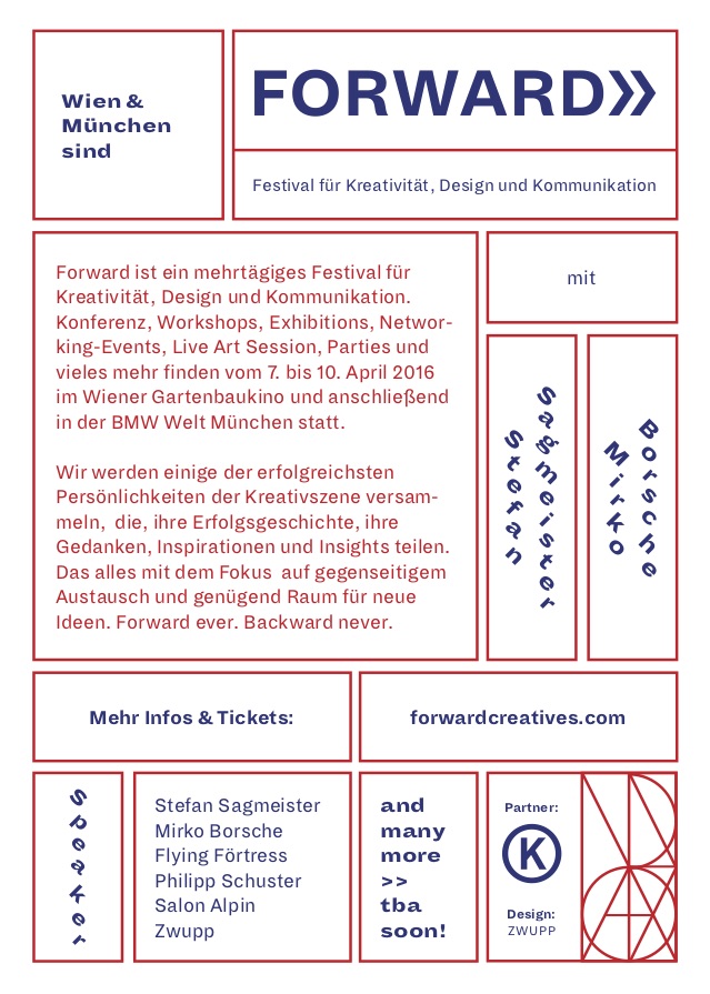
The year after, the graphic studio Zwupp was responsible for Forward Festival’s design and thus the Wiener Werkstätte moved into the graphic identity. Zwupp took samples from the Wiener Werkstätte and developed them on the basis of their own pattern system. This system still forms the basis of the graphic identity of the Forward Festival today. The reference to the Wiener Werkstätte also gives expression to our Viennese origins. Just as the founders of the production community - Josef Hoffmann and Koloman Moser - aimed to renew the concept of art of their time, we aspire to create a new awareness of the achievements of creatives nowadays. In addition, Forward and the Wiener Werkstätte connects a multidisciplinary approach. The latter was the first collective that brought together architects, artists and designers to work on the same project. In this sense, it is a role model for Forward. It is our goal to bring people from different creative backgrounds together. The basic idea of the festival is that an exchange takes place over several scenes and creatives network with each other. Also, the Wiener Werkstätte had long-lasting effects on European culture and arts. This shows us which value collaborations can have. Therefore, this is an incentive for us to give our best every day to make Forward an unforgettable experience for everybody.
The year after, the graphic studio Zwupp was responsible for Forward Festival’s design and thus the Wiener Werkstätte moved into the graphic identity. Zwupp took samples from the Wiener Werkstätte and developed them on the basis of their own pattern system. This system still forms the basis of the graphic identity of the Forward Festival today. The reference to the Wiener Werkstätte also gives expression to our Viennese origins. Just as the founders of the production community - Josef Hoffmann and Koloman Moser - aimed to renew the concept of art of their time, we aspire to create a new awareness of the achievements of creatives nowadays. In addition, Forward and the Wiener Werkstätte connects a multidisciplinary approach. The latter was the first collective that brought together architects, artists and designers to work on the same project. In this sense, it is a role model for Forward. It is our goal to bring people from different creative backgrounds together. The basic idea of the festival is that an exchange takes place over several scenes and creatives network with each other. Also, the Wiener Werkstätte had long-lasting effects on European culture and arts. This shows us which value collaborations can have. Therefore, this is an incentive for us to give our best every day to make Forward an unforgettable experience for everybody.
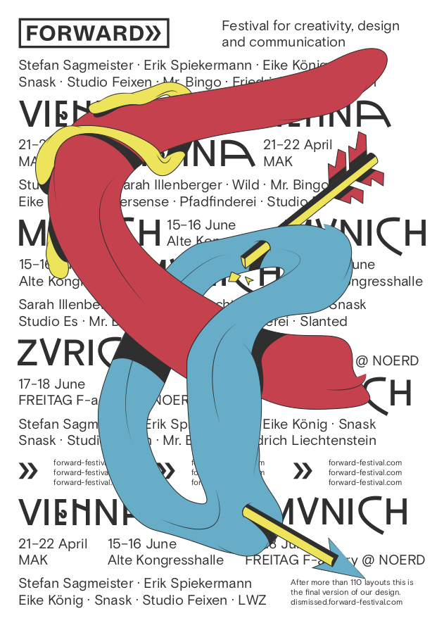
The design of the festival year 2017 further developed the color codes of the festival cities. While in 2016 it was blue and red for the two festival cities of Vienna and Munich, the color code was renewed due to adding another Forward Festival in Zurich. The new colors were inspired by the cities coat of arms. Thus, Vienna became red, Munich yellow and Zurich blue. The typeface, which is strongly inspired by the Wiener Werkstätte, and the strong contrast between the typeface and the organic, round shapes immediately catch your eye. In addition to the key visual on the festival’s motto “The Birth of an Idea”, the design studio Zwupp made 110 additional poster layouts. These posters didn’t make the final cut. However, these did not go down the trash but were presented to the public at Forward Festival in the exhibition “Gallery of Dismissed”.
The design of the festival year 2017 further developed the color codes of the festival cities. While in 2016 it was blue and red for the two festival cities of Vienna and Munich, the color code was renewed due to adding another Forward Festival in Zurich. The new colors were inspired by the cities coat of arms. Thus, Vienna became red, Munich yellow and Zurich blue. The typeface, which is strongly inspired by the Wiener Werkstätte, and the strong contrast between the typeface and the organic, round shapes immediately catch your eye. In addition to the key visual on the festival’s motto “The Birth of an Idea”, the design studio Zwupp made 110 additional poster layouts. These posters didn’t make the final cut. However, these did not go down the trash but were presented to the public at Forward Festival in the exhibition “Gallery of Dismissed”.
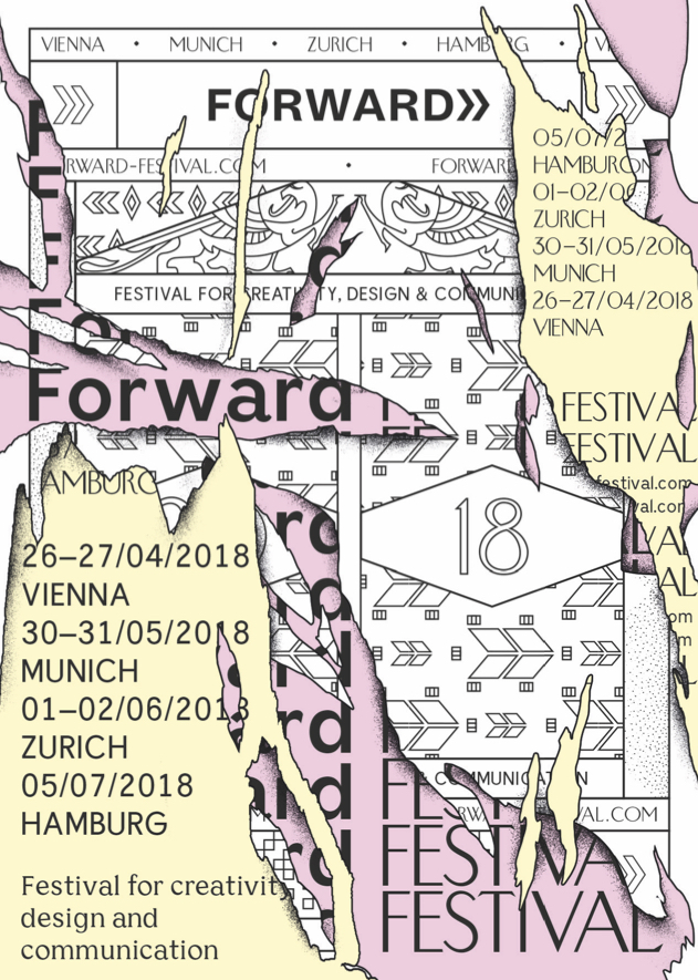
The visual identity of Forward Festival 2018 reflected the festival topic “Construct-Deconstruct”. The interplay of Wiener Werkstätte inspired elements and contemporary graphic design indicates the two-sided story of every final product or concept. Pablo Picasso once said “every act of creation is first an act of destruction”. The great Spanish artist points out that destruction isn’t a system failure but necessary to create something new. In line with ol’ Pablo we want to deconstruct outdated structures so that a new way of thinking can take place. In the process we celebrate the creativity of these acts because smashing things is always fun, isn’t it?
The visual identity of Forward Festival 2018 reflected the festival topic “Construct-Deconstruct”. The interplay of Wiener Werkstätte inspired elements and contemporary graphic design indicates the two-sided story of every final product or concept. Pablo Picasso once said “every act of creation is first an act of destruction.” The great Spanish artist points out that destruction isn’t a system failure but necessary to create something new. In line with ol’ Pablo we want to deconstruct outdated structures so that a new way of thinking can take place. In the process we celebrate the creativity of these acts because smashing things is always fun, isn’t it?

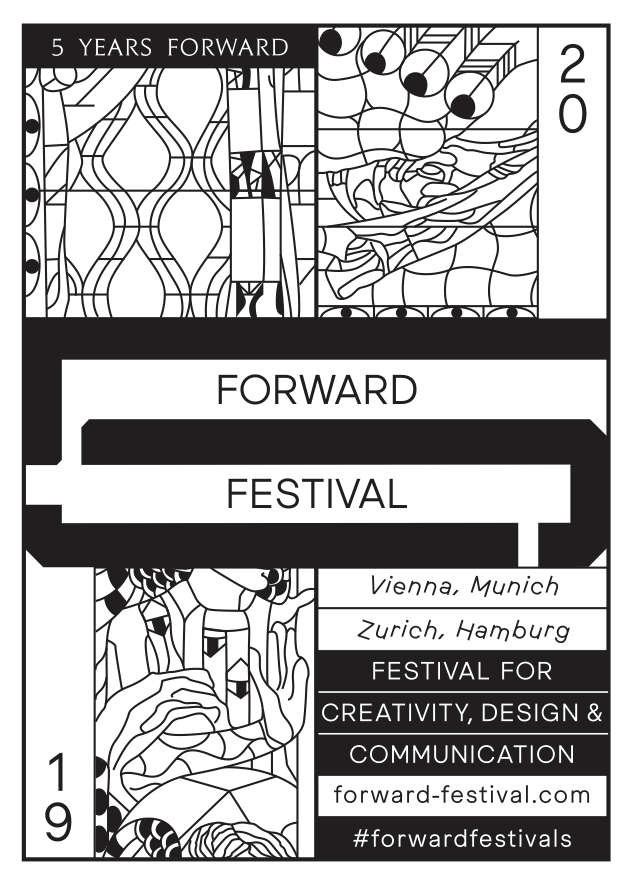
This year’s festival design pays homage to Koloman Moser, one of our greatest sources of inspiration, who celebrated his 150th birthday in 2018. His work has influenced us on several levels. Koloman Moser was the Art Director of the Wiener Werkstätte and the Wiener Secession. His work is characterized by incredible versatility. He has designed everything from furniture over jewellery to posters. A characteristic that is also reflected in the approach of the Forward Festival. Thus, the playful details of the festival’s graphic identity are reminiscent of the glass windows by Koloman Moser in Otto Wagner’s church of Steinhof, Steinhofgründe in Vienna, which are taken from the beginning of the 20th century to the present by the vivant colours of this year’s graphic design. ●
This year’s festival design pays homage to Koloman Moser, one of our greatest sources of inspiration, who celebrated his 150th birthday in 2018. His work has influenced us on several levels. Koloman Moser was the Art Director of the Wiener Werkstätte and the Wiener Secession. His work is characterized by incredible versatility. He has designed everything from furniture over jewellery to posters. A characteristic that is also reflected in the approach of the Forward Festival. Thus, the playful details of the festival’s graphic identity are reminiscent of the glass windows by Koloman Moser in Otto Wagner’s church of Steinhof, Steinhofgründe in Vienna, which are taken from the beginning of the 20th century to the present by the vivant colours of this year’s graphic design. ●

INTERVIEWS
ARTICLES